Emily Lee | UI / UX / Visual Designer
Emily Lee | UI / UX / Visual Designer
1. FORM REDESIGN
Redesigned Form to Simplify User Interaction and Improve Clarity
In UX design, forms play a key role. If a form isn't clear, inviting, and visually appealing, users may be hesitant to provide their information.
A customs declaration is an official document that details the contents of goods in the package being imported or exported, indicating a person's intention to place those goods under a specific customs procedure. I had the opportunity to redesign the customs declaration form with a focus on improving its usability and clarity. This involved simplifying the structure, removing the hidden tooltip text that was previously only visible on hover, making the information more accessible and easier to read, and adding clear warning messages. Additionally, I created custom icons that align with the branding, logically organized the questions to reduce user overwhelm, and ensured the form remained concise with only the most essential fields. I also incorporated valuable feedback from the marketing team by adding an "Important Notes" in parcel value section. This informs users that the declared value of their items is for insurance and customs purposes. If a package is lost or damaged, the declared value will be used to determine the refund amount.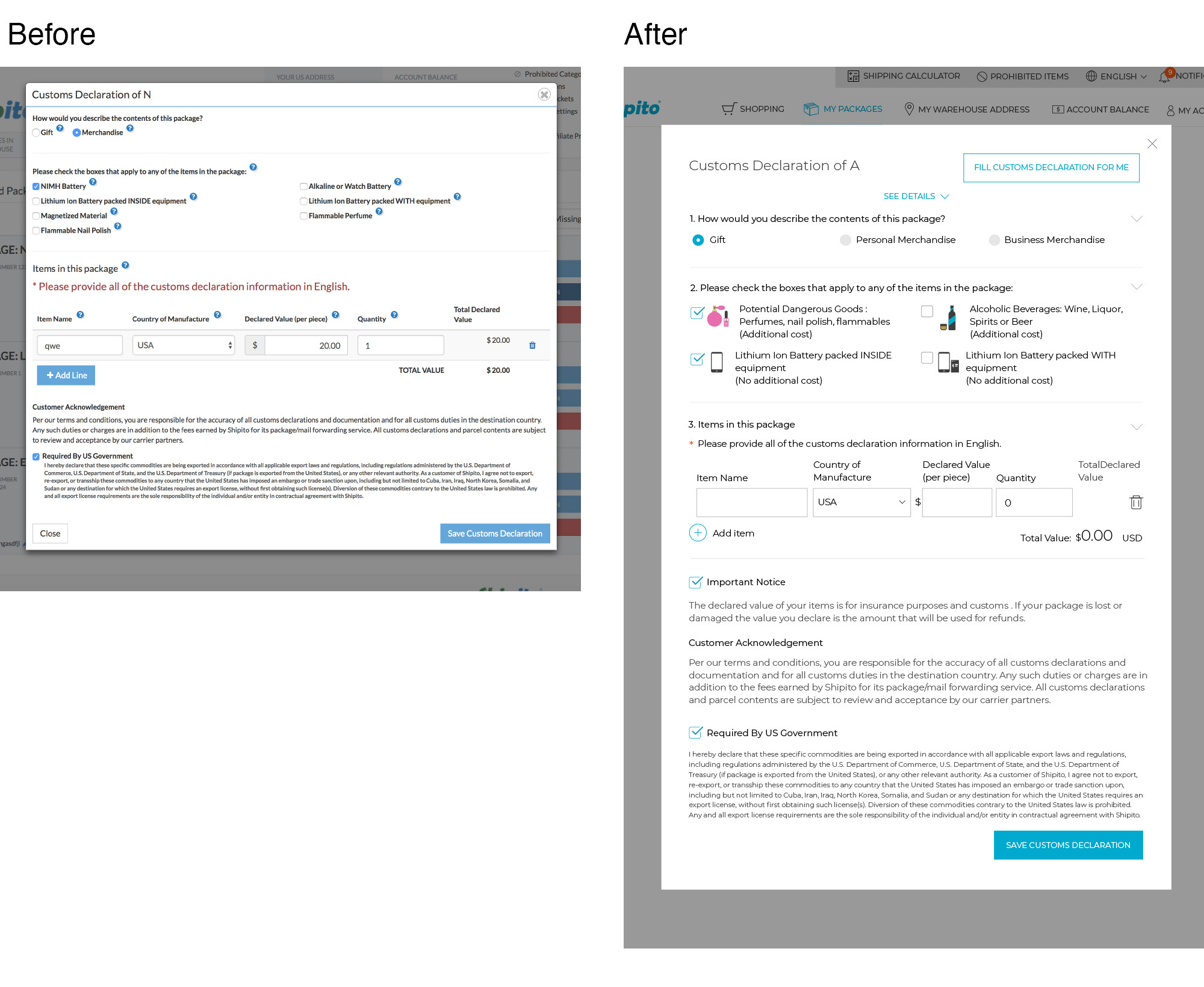
Providing Clear Feedback and Reducing User Confusion with Warning and Confirmation Popups
I also added necessary warning popup messages to inform users about the confirmation status. Previously, there were no warning or notice messages, which led to confusion as users were unsure whether they had clicked or tapped the button correctly. The addition of these popups provides clear feedback, improving the overall user experience and preventing potential mistakes.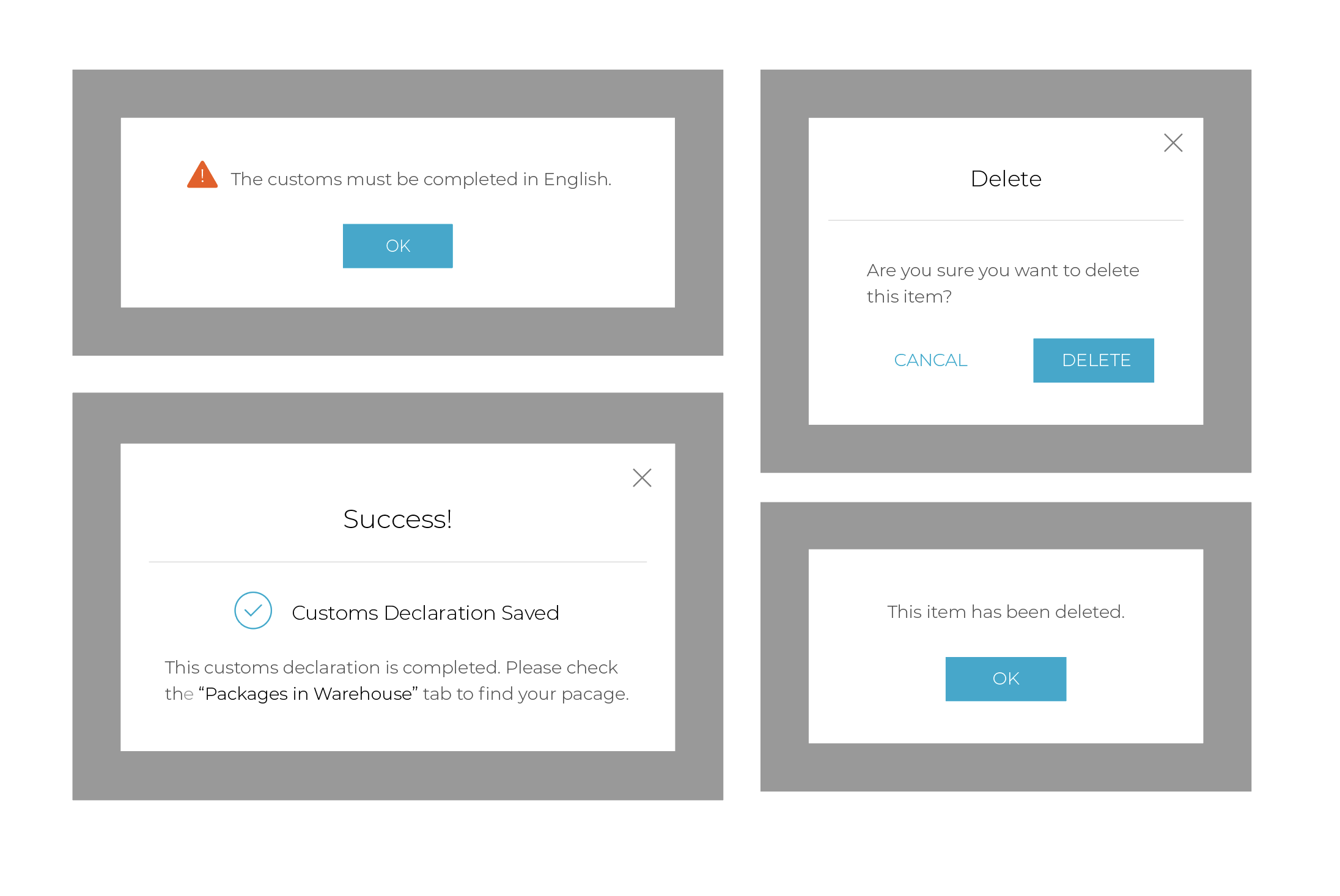
Enhancing Usability and Reducing Clutter with Toggle for Expanding/Collapsing Details
The user can toggle the visibility of details by clicking or tapping the 'See Details' or 'Hide Details' button to expand or collapse the information. I placed the description under each item, which can be expanded or collapsed to show or hide the details. This expanding and collapsing functionality allows users to view only the information they need at the moment, improving readability and reducing visual clutter on the page.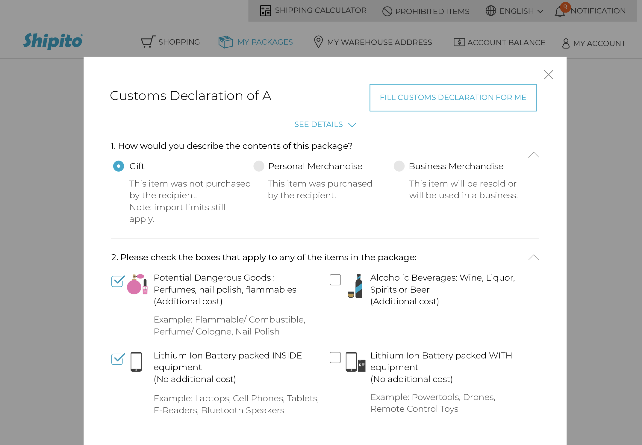
2. REDESIGN OF CHANGE PASSWORD INTERFACE
Enhanced Change Password Form Design
The previous change password popup was a bit outdated, with wide input fields and an older design. I made some adjustments to improve its visual appeal and usability. Additionally, I updated the password reset requirements to enhance both security and user clarity. These updates aim to improve the overall experience by making the form more user-friendly and easier to navigate, while also ensuring a more secure process.
Mobile Version Design

3. SIGN-UP, LOGIN, AND FORGOT PASSWORD REDESIGN
The Sign-Up, Login, and Forgot Password pages have been redesigned to improve the user experience on both desktop and mobile devices. The previous design was a bit outdated and didn’t make the best use of space, which sometimes made the process feel less straightforward. For this update, I focused on creating an adaptive design that adjusts to different screen sizes, providing a smoother experience across all devices. The new layout is simpler and more intuitive, with updated icons that match the modern design style and feel more user-friendly. Whether on desktop or mobile, the pages now adjust automatically to provide a more efficient and convenient process for signing up, logging in, and resetting passwords.
4. EMAIL VERIFICATION
Design of Email Cerification Series
I redesigned a series of email verification processes to improve the user experience. The email verification rollout was successful. Email verification is the most common method to authenticate users and activate their accounts once they confirm their email.
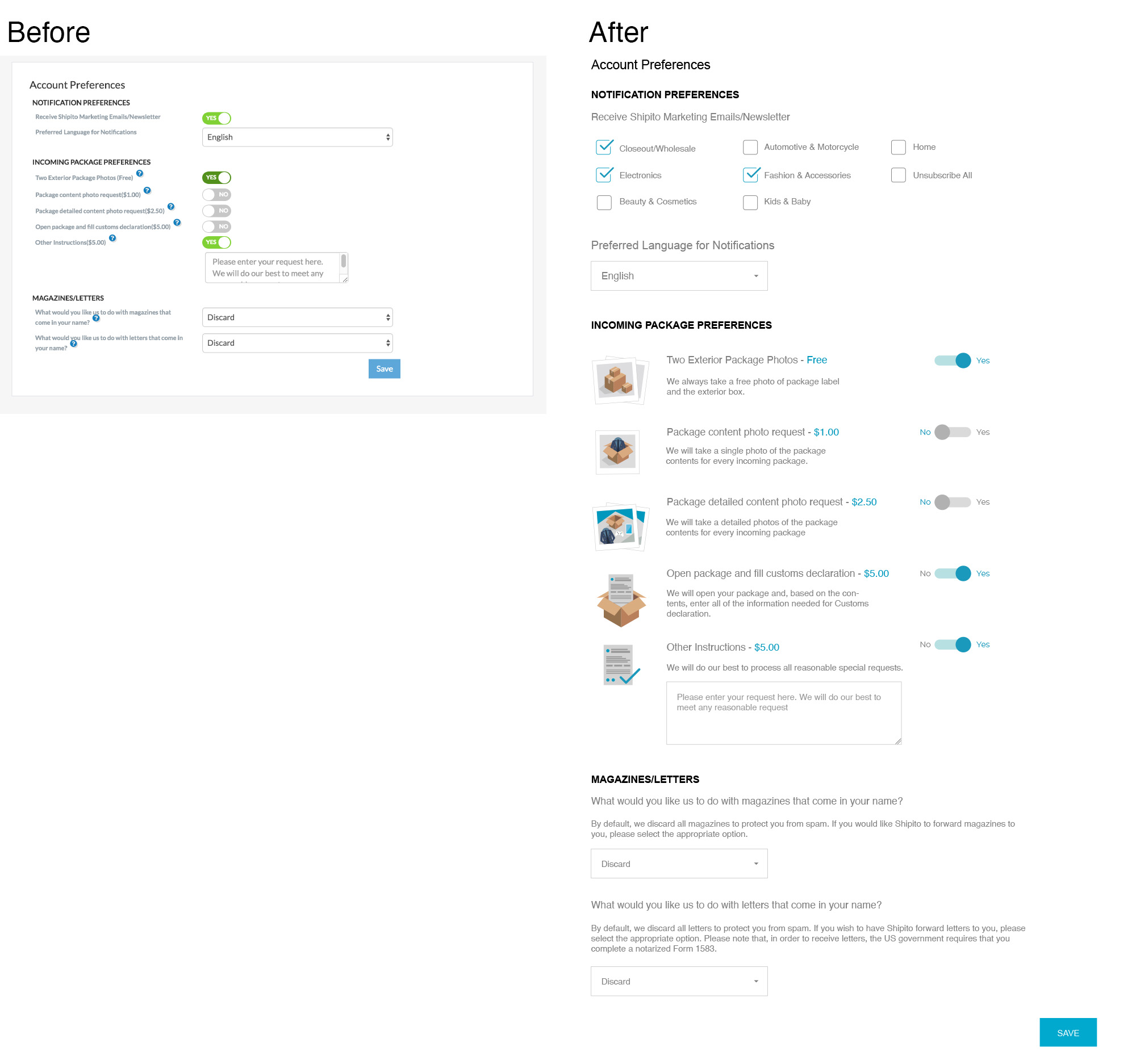
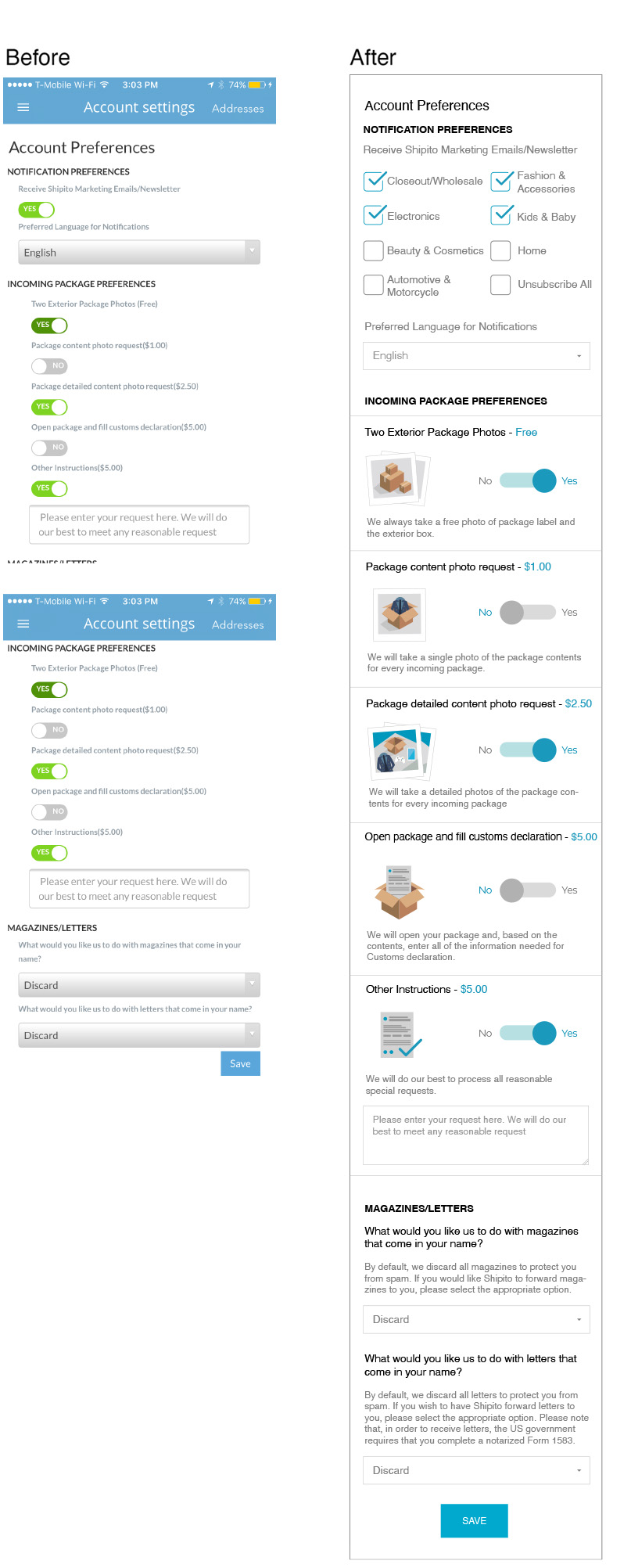
5. ACCOUNT PREFERENCE UPDATES
I had the opportunity to work on redesigning the customs declaration form with the goal of making it more user-friendly and visually clear. In this process, I simplified the structure, removed the hidden tooltip text that was previously only visible on hover, updated the toggle buttons, created vector icons, and added a "Notification Preferences" section. I also worked on making the pricing for each item more readable and included the necessary questions to improve the overall experience. Additionally, I removed the inner drop shadow effect in the box and replaced the old gradient button style to create a cleaner, more modern look.
Mobile Version Design
I made the adjustment to switch to a sticky menu bar on mobile, which should improve accessibility and make navigation easier. On mobile devices, especially with adaptive design, replacing the stacked menu buttons with a sticky menu bar creates a more consistent and intuitive interaction, aligning with standard mobile UX practices.
I also provided a code example after doing thorough research, which I hoped would help improve communication, speed up the process, aand make the feedback more actionable for the developer. The content design below the sandwich menu and sticky menu bar was changed later.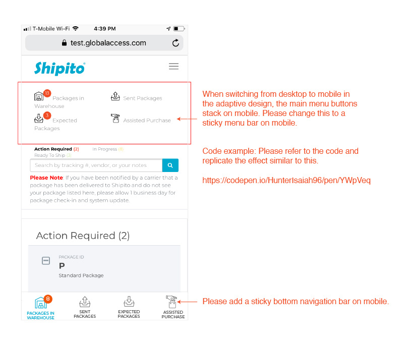
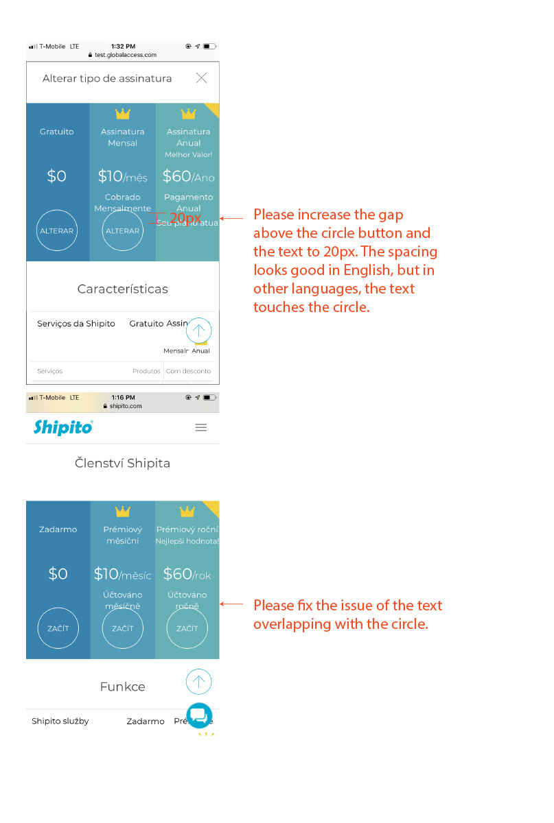
7. VISUAL AND TECHNICAL QA (QUALITY ASSURANCE)
QA (Quality Assurance) is a crucial part of the design process. For a UI/UX designer, QA is an essential form of problem-solving. I conducted both visual and technical QA to ensure that the pages were fully refined and ready for rollout. Below are the QA documents with annotated images, communicated with the developers. The issues have been fixed.